
New College UNSW
Institutional brand strategy and architecture
New College is a dual-community residential college at UNSW, with fifty years of accumulated sub-brands, a postgraduate village, a lecture series, a research centre, each with its own identity. At a recent university expo, the New College stand said "Living at University" before it said New College. The stand next to it, UNSW's, used one colour and one message. They didn't outspend New College. They out-simplified it.
The tension underneath.
A Christian institution housing students of every background needed a brand that was honest about its foundation without making that foundation a barrier. The residential communities needed to lead with excellence, community and pastoral care, while the public Christian voice needed a home of its own.
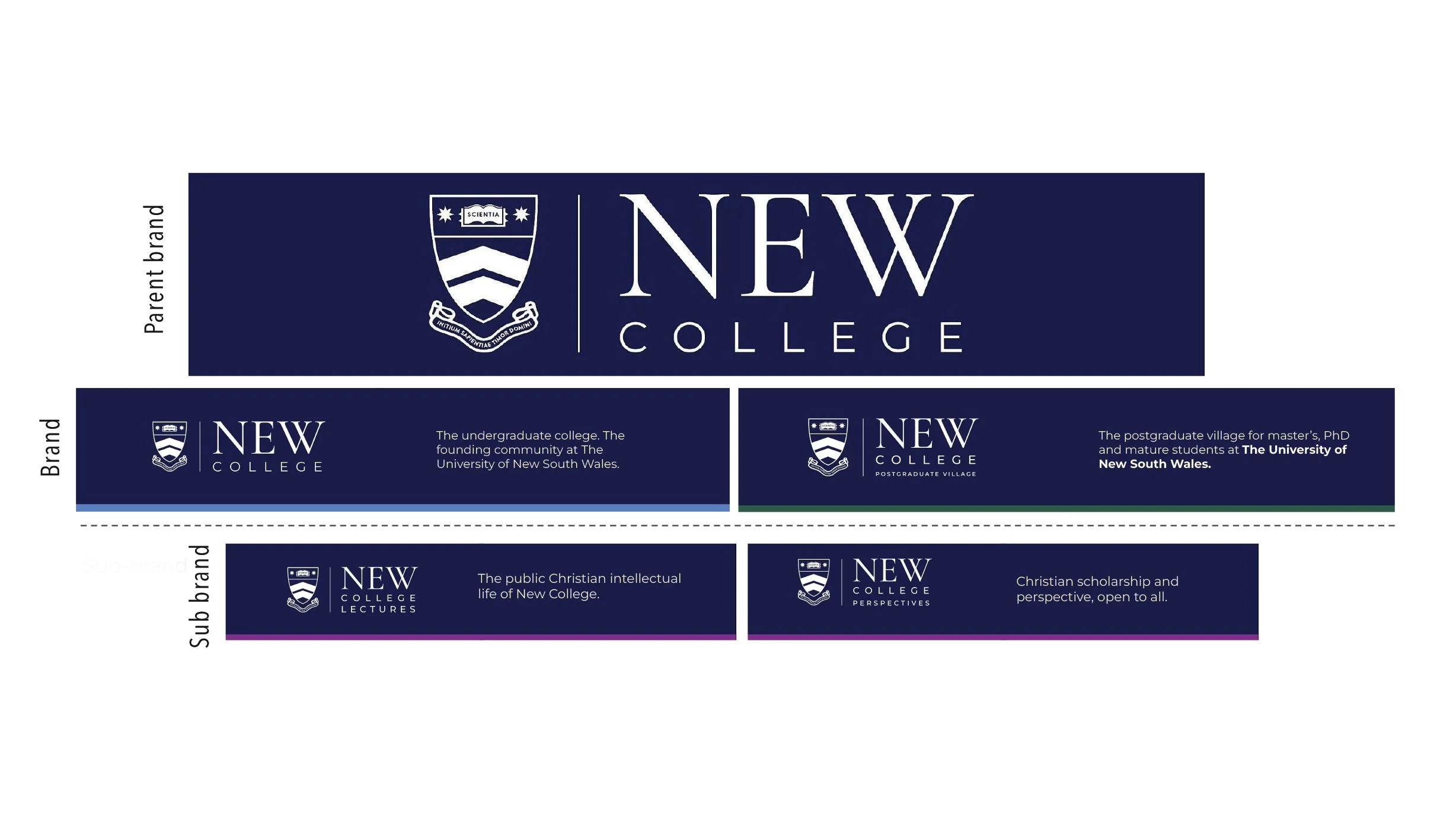
Image of brand architecture
The architecture.
One parent brand, two communities, many expressions. New College already held the heritage, so there was no need to invent something new above it, faith is the foundation, not the front door. New College Lectures and New College Perspectives (formerly CASE) now carry the public Christian voice. The brand line, Excellence through community, holds the distinction: excellence is the outcome, community is the mechanism.
What I built.
Led the strategy end to end with the Master and senior leadership, and took it through the board: the parent brand architecture, four brand themes, the positioning, the brand line and manifesto.
CASE sat outside the family entirely, an independent publication with its own name and identity, at odds with its real role as the College's public Christian voice. I led the process to close that gap: stakeholder review across the senior team, an audience analysis, and more than 100 names explored across five themes, before landing on New College Perspectives, a name and design system that puts it inside the family alongside New College Lectures.
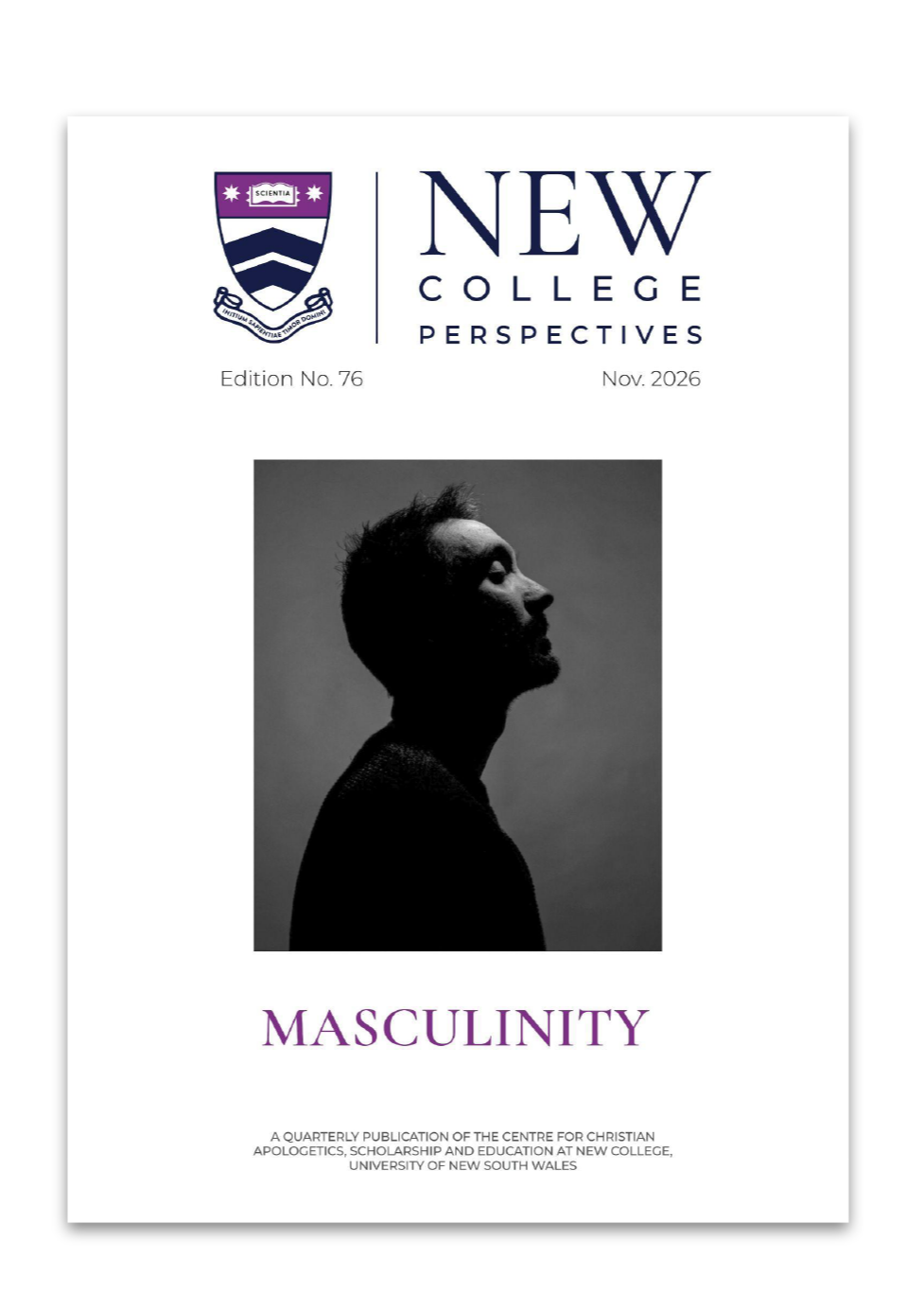
I set the logo system, visual identity and tone of voice, now codified in a full guidelines document that governs how the College looks and writes across every touchpoint.
I'm now leading the website redevelopment. I diagnosed the site's structural problems using its own analytics, 46 of 102 pages getting fewer than 200 views, an average homepage visit of 23 seconds, then built the business case and ran the vendor evaluation that's shaping the rebuild.
What changed.
The architecture was endorsed by the board and is designed to scale, New College can add colleges and centres without ever renegotiating who it is. Communications built on the new positioning are already outperforming sector benchmarks. The redesign is now rolling out across every touchpoint: website, brochures, stationery, email footers, and internal communications.
Before and after expo stand.
The old stand led with "Living at University," a shared umbrella brand across several colleges that had no recognition and no visual equity to draw on. I moved away from it and rebuilt the space around the partnership that actually mattered: UNSW. Borrowing UNSW's own visual language meant New College wasn't just decluttered, it was aligned with the one name in the room students already knew and trusted. New College went from roughly a third of the table's visual space to half.
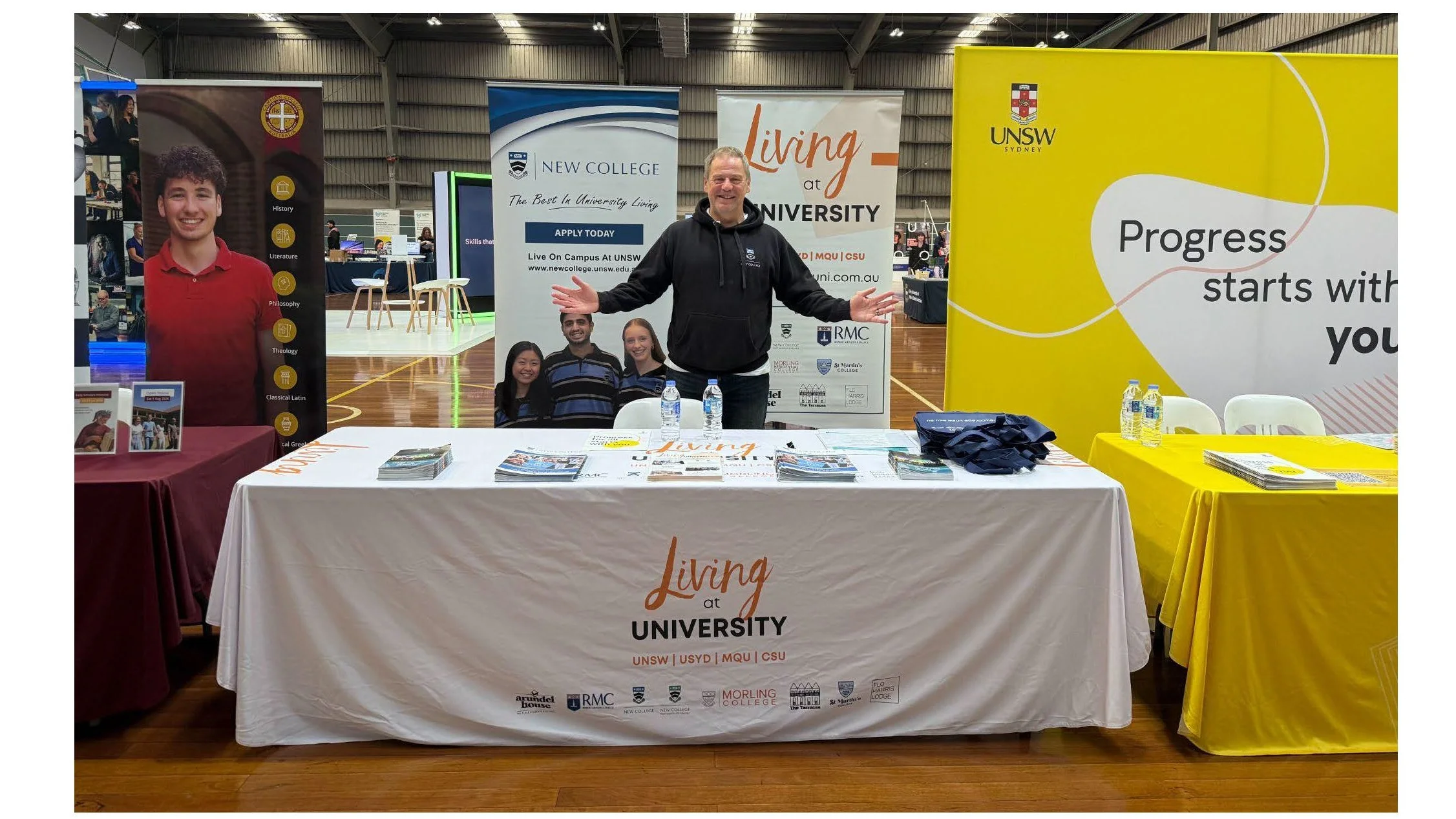
Expo 2026
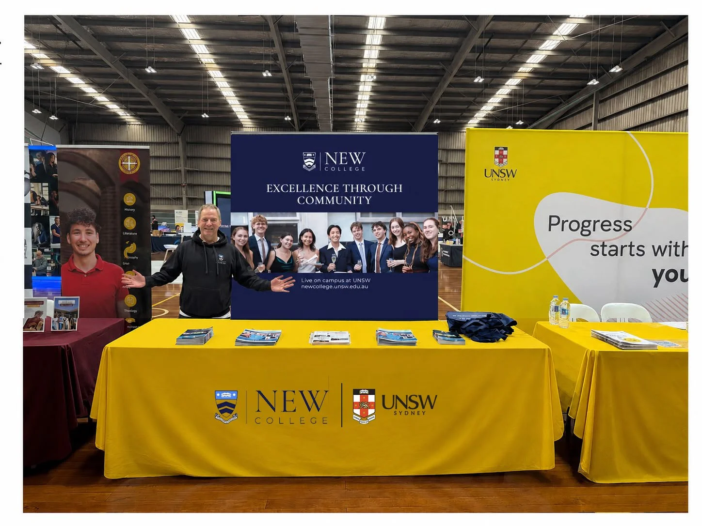
Expo for 2027